loading pixels tweaking margins squinting eyes edging borders shifting elements correcting my posture

Sports Pride

Sports Pride

I was commissioned to create a dynamic and inclusive brand identity for Sports Pride, a community-driven event celebrating LGBTQIA+ inclusivity and diversity in sports. This non-profit initiative aimed to encompass a wide range of sports, from football and rugby to athletics and horse riding.

Sports Pride aimed to foster a sense of community and inclusion within the LGBTQIA+ sports realm. The brand needed to be vibrant, welcoming, and representative of the diverse sports involved, while also integrating elements of the Progress Pride Flag and not being cliché.

About the Business

Sports Pride was planned to be a non-profit endeavour for the LGBTQIA+ community featuring a diverse array of sporting events aimed at building equality and inclusivity in the world of sport. “From football and rugby to athletics and horse riding – every sport is included in Sports Pride.”

My Role

  • Avatar of George Beresford George Beresford Logo Designer, Brand Designer

Target Audience

LGBTQIA+ communities, sports enthusiasts, athletes of all ages.

Project Disciplines

Logo Design, Branding, Print Design

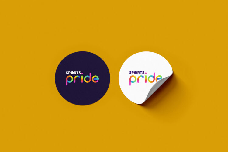
Trace-lines of ball in movement inspired this client-preferred design direction

The project began with extensive research into sports iconography and LGBTQIA+ symbols to develop a concept that balanced energy and inclusivity. The primary challenge was designing a logo that symbolised a wide array of sports without relying on typical and over-used representations. The colour palette was derived from the Progress Pride Flag, but modified to suit the brand’s energetic and playful tone. The final logo captured the essence of movement and inclusivity, featuring a stylised ball symbolising movement in various sports.


Challenges

To design a sports logo that inclusively represents all varieties of sports, while avoiding common clichés and ensuring it remains fresh and visually appealing.

Solution

A common denominator across most sports is their use of balls. This inspired me to focus on this symbolism. It's inclusive, representing numerous sports without favouring any particular one, and embodies the energy inherent in sports. The ball iconography serves as a subtle yet powerful representation of the diversity and excitement within the sporting community, making it both a universal and distinctive element.

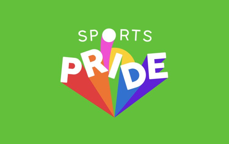
The client approved this design direction as their final logotype.
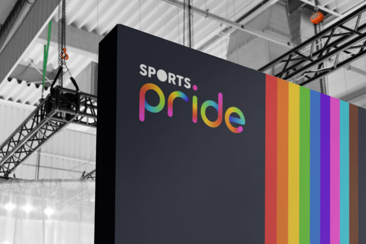
Branded event wall mockup showcasing the Sports Pride logo and Progress Pride Colours
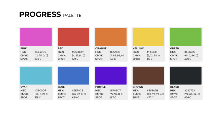
Final "Progress Pride" palette chosen for Sports Pride's logotype.
Client-rejected logo concept that emphasised the playful and dynamic nature of sport. Symbolic of breaking through stigma surrounding LGBTQIA and Sport.
A crest-less mark exploration showcasing the usability for different scales.
The client wished to explore adding crest and shield backgrounds, to better match a previous design concept, but this resulted in an unbalanced design
Explorations also included representing all 11 colours of the Progress Pride Flag in one mark
The client initially provided the top pastel colour palette which they liked. I helped select a more suitable, vibrant and dynamic colour palette that better captured the essence of Sports Pride.

Conceptual designs and branding explorations that could have been a reality

Branding Design isn’t just about the logo, and making it look good. Us designers imagine them in use out in the real world, and as part of my logo design and branding packages it’s up to me to explore their practicality before presenting to the client. As part of the pitch deck, I included branded mockups of various applications with all three conceptual logo-marks, to help the client visualise them in practical use for themself.

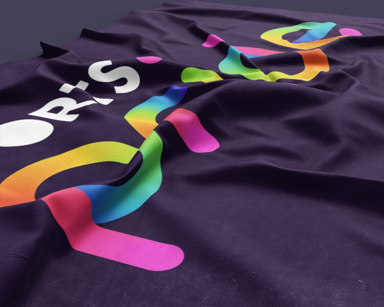
Printed vinyl window mockup showing how the gradient would print with added noise and speckle to prevent colour banding
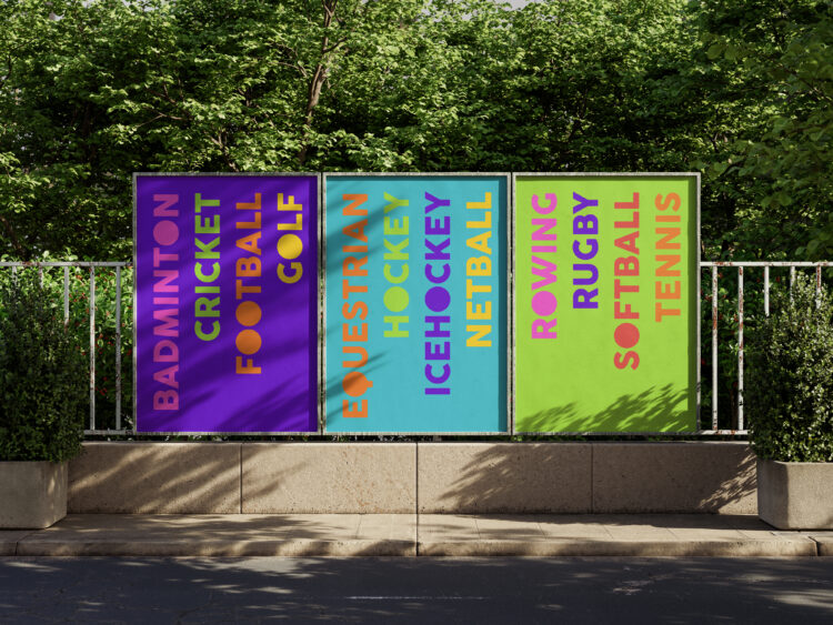
Poster exploration to showcase how ad placements in conjunction with one another could solidify the branding without needing to display all colours at once
Copy and advertising exploration to showcase all sport is included in Sports Pride.

Project Conclusion

Despite the project’s cancellation due to COVID-19, the branding elements developed could have significantly contributed to the event’s community impact and visibility. The Sports Pride project showcased my ability to create a cohesive and inclusive brand identity under challenging circumstances. Through collaborative design processes and innovative problem-solving, I delivered a brand that celebrated diversity in sports and resonated with the LGBTQIA+ community.
Let's talk - 3D rendered graphic, bubble text

Let's create a brand that feels like you – and attracts them.

No-one should experience that second-brand embarrassment. If your logo and identity doesn't represent you, it isn't working for you — let's fix that.